
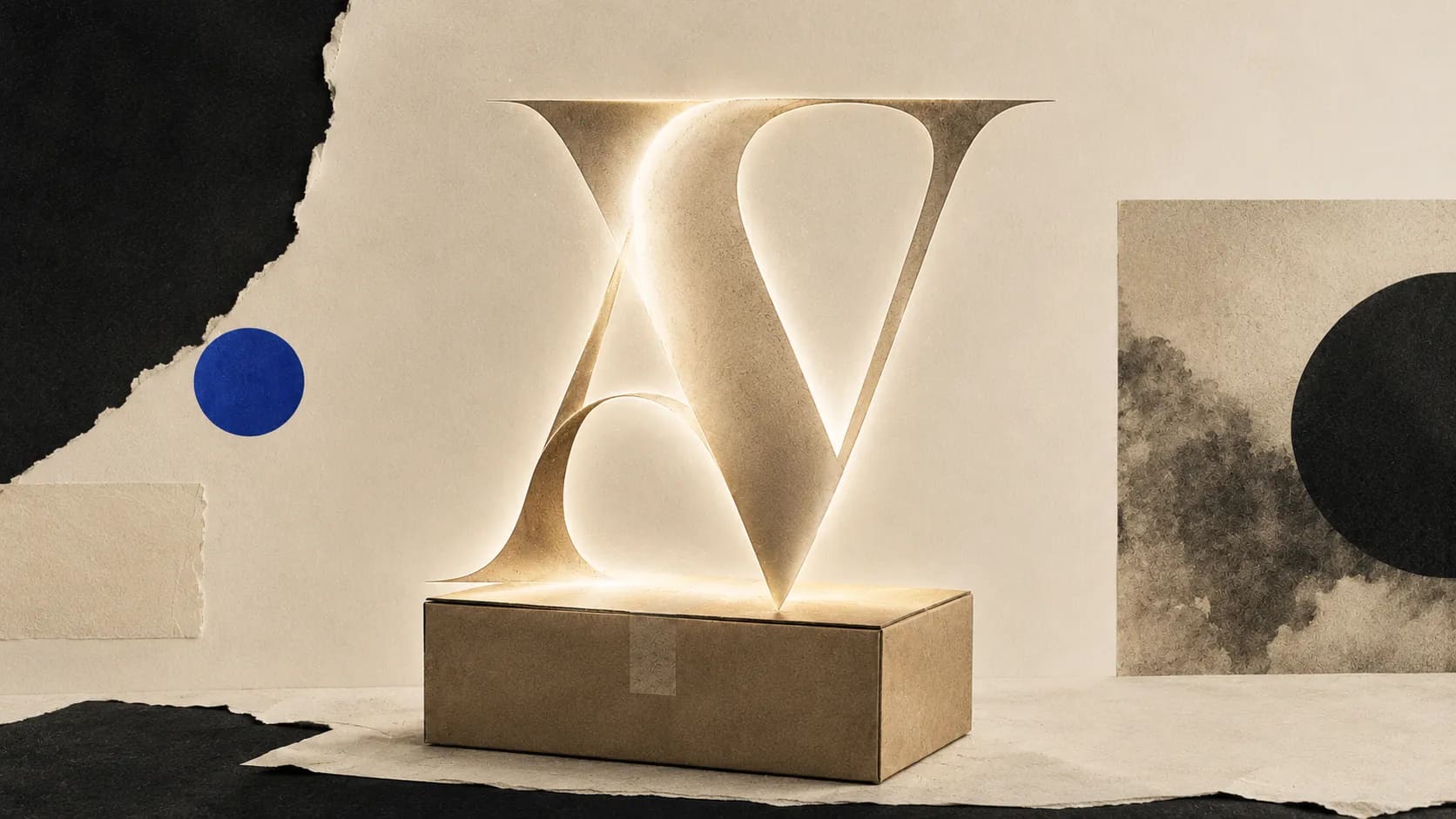
Official reveal
Short Preview Summary
A room that came to confess and left having described a whole vocabulary of trust hiding inside letterforms.
Main Signal Waves
[{"read": "Aesop, perfume, ghost kitchens, pharmacy relabels — the room keeps arriving at industries where the product does not really appear on the screen. The typography is the product until the box is opened, and sometimes even after.", "title": "Categories that barely exist without the letters"}, {"read": "A business card in a proper text face means the person owns a house. A poetry book in Caslon means the grandchild has won something. A lease switched to Inter is 'a thousand dollar font swap.' The room is describing status they have not achieved, being read into letters they did not choose.", "title": "Class read through letterforms"}, {"read": "One Signal insists price does the real work and the font only decorates it. A single confession from a course seller — same product, only the type changed, conversion up 18% — quietly retires the counter-argument without anyone announcing the retirement.", "title": "The counter-argument the room could not hold"}]
Full Official Reveal
You can feel the room settling on a single admission before it names one: we have all handed over more money than something was worth because the letters on the label composed themselves in a certain way. Nobody comes in defending typography as a moral force. They come in confessing.
The most striking thing isn't that it happens. It's how quickly people accept that the mechanism is real, and then how much time they spend describing the exact circumstances in which they fell for it. Olive oil in a warehouse bin. A pharmacy relabelling its own cough syrup so it looks like it came from Zurich. A menu where "single-origin" is set in something condensed and italic and the price triples without argument. The examples pile up in a way that feels less like memory and more like a running joke people didn't know everyone else was in on.
Underneath that joke there is a real seam. Several Signals sit inside industries whose entire business model is typographic. Aesop, referenced explicitly, "convinced my brain that hand soap could be a philosophy." Perfume, another contributor argues, is "entirely" typography, because "nobody smells anything through a screen. You smell the font." Nothing about those observations is playful. They are describing a category where the product barely exists until the letters do the work. That's a heavier claim than it looks.
The room mostly agrees with the mechanism. It does not entirely agree on where the credit belongs. One Signal cuts against the whole conversation: "Price signals value, then the font just decorates the price." If it costs more you decide it looks smarter. That's a real correction. It suggests the typeface is not doing the work, it is only being blamed for the work, because we need something to point at when we notice we've been convinced.
But then a different Signal breaks that argument by putting its own body under the wheels. Someone selling training courses tells the room what happened when they changed the type. "Switched from a friendly sans to a stern old-style serif. Conversion up 18%. Product identical." Price wasn't decorated. Price didn't move. Only the letters did. That's the moment the room stops arguing.
Two smaller waves keep surfacing.
One is a class wave. Business cards in a proper text face signal that the person "owns a house." A self-published poetry book set in Caslon convinces a grandmother her grandchild has won an award. A landlord's lease switched from Times New Roman to Inter is described as "a thousand dollar font swap." Each of these treats typography as a stand-in for status the person hasn't actually attained. The room is quite clear-eyed about this. They know they are reading class through letters, and they know the letters lie.
The other is an institutional wave. A small local museum widens its signage into a humanist sans and attendance doubles. Same paintings, same building. The story is offered without triumph. It's offered slightly appalled. Because if a set of letters can double the number of people willing to look at art that was already there, then something has shifted in how people decide what deserves their attention, and the shift is not really about the art.
What the room won't quite say out loud is that this all works on them too. Every Signal is written in the first person. Every confession comes with the shrug that follows a confession. Nobody thinks they're above it. Even the person who insisted that price does the real work admits, in the same breath, that the font "decorates" it, which is a strange word to use for something you claim doesn't matter.
The through-line is that expensive is a legibility choice before it is a price. When we read a face as expensive we relax into the object. We stop asking what it costs to make. We start asking what it costs to belong. And on the other side of that shift there is always a small, embarrassed sentence like the one about the museum, or the pharmacy, or the receipt: same thing, better teeth.
The room's real finding is not that typography can make things feel more valuable. That's obvious. The finding is that we've built an entire vocabulary of trust that operates without us noticing, and that the vocabulary is legible even to people who spend their lives arguing they can't read it.